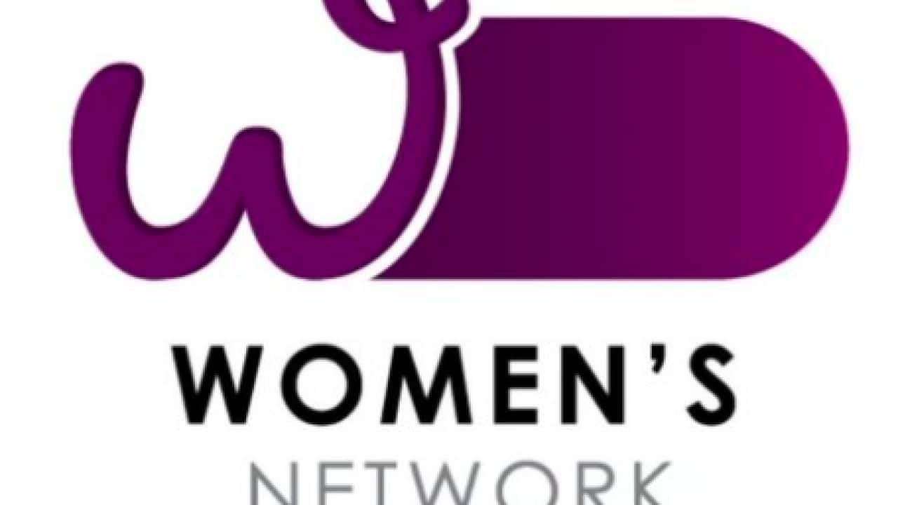
Australians have slammed a new logo for the Department of Prime Minister and Cabinet's Women's Network, describing it as "degrading" and "tone deaf".
The purple logo shows a curly purple "W" and a purple bar, which together carries a strong likeness to male genitalia.
Yumi Lee at the Older Women's Network described the logo as "ludicrous" and "insulting".
"They have designed and used a logo for the Women's Network which, when you look at it, is so insulting to us. It just totally illustrates how out of touch they are," she told SBS News.
"It is demeaning, it is degrading, and it is a massive slap in the face."
The Women’s Network is one of a number of networks within the Department of Prime Minister and Cabinet (PM&C), all of which have similar logos using bars of different colours.
According to the department, the network "champions equal opportunity on behalf of its members and is an inclusive volunteer-based organisation built by members, for members".
It also "assists PM&C on enabling cultural change aspirations expressed in the Department's 100-1000 day plan for transformational change by helping implement PM&C's Gender Equality Action Plan and Embracing Inclusion and Diversity Program".
Ms Yumi said the use of "aspirations" in the description was a problematic as the logo.
"It's not enabling cultural change. It's enabling cultural change 'aspirations'. So we are so far behind that we have to facilitate people to feel like they want to change the culture. It's like saying, let's dream about it some more. It should be enabling cultural change 'to take place'," she said.
"The purpose of the network to enable the 'aspirations' or the 'dreams' of cultural change is so pathetic and it goes with the logo," she said.
"Women are upset and angry. We don't care if you use this for something else. Just don't use it for the Women's Network. We are very upset about how little they have thought about women and it just symbolises everything that is wrong with this government's approach with regards to women's issues."
Jess Lane, Founder of Women for Australia, a network that aims to amplify the voices of Australian women, was also stunned at the Women's Network logo.
"I thought gender equity in Australia had hit an all-time low with Tony Abbott's self-appointment as Minister for Women. But after the nightmare year that has been, for a Morrison government department to produce and approve a logo for their new Women's Network that looks so obviously like a phallus - we have a new winner! I laughed, of course. Otherwise, I would have cried," she told SBS News.
"This latest blunder is, unfortunately, completely symptomatic of a government that is not only tone-deaf and indifferent, but also outright hostile, towards women's issues in Australia."
Meanwhile, author Quentin Dempster said the logo "satirises what all women and men of goodwill are trying to achieve: the empowerment of women, equal rights and an end to a culture of violence, sexual assault and misogyny".
Despite a substantial list of questions from SBS News on the response to the logo, the Department of PM&C stated simply that the logo was designed internally.
"No external providers were engaged for this work," the statement read.
The office of Prime Minister Scott Morrison and Minister for Women Marise Payne were also contacted for comment.
The Morrison government has come under fire repeatedly for its treatment of women. The
found more than half (51 per cent) of all people surveyed in the report had experienced at least one incident of bullying, sexual harassment or actual or attempted sexual assault.
The review was set up last year in the wake of allegations by former Liberal staffer Brittany Higgins, who went public with claims she was raped in a ministerial office in 2019.
The findings from the Jenkins review were underpinned by concerns parliament was not a safe environment to work in because of systemic concerns around "gender inequality and exclusion and a lack of accountability".
Labor, the Greens and crossbenchers have been pressuring the Coalition to implement all 28 recommendations of the Jenkins review.
Queensland Greens Senator Larissa Waters described the logo as "pathetic and juvenile, but completely to be expected from this toxic boys' club of a government".
"Sure, it's just a logo, but if you need a visual representation of just how completely out of touch the PM is with Australian women you honestly couldn't do any better," she said in a statement posted on Twitter.
"Another reminder that we need to implement all 28 recommendations of the Set the Standard report, including gender and diverse reputation among parliamentarians, parliamentary staff and in all departments."
Federal Independent MP Zali Steggall on Sunday said the Women's Network logo "beggars belief".
"You can't un see it! I thought the
was the worst marketing effort. I stand corrected," she tweeted.
Last April, rape prevention advocates criticised
One video featured an interaction between a teenage girl and her partner after she encourages him to try her milkshake, before smearing it over his face. The video went on to include examples of drinking milkshakes, eating pizza and "touching your butt" as scenarios that would require consent.
At the time, Fair Agenda and End Rape on Campus Australia (EROCA) said in a statement the videos were often "confusing" and didn't address the kind of behaviours young people are likely trying to navigate.
The Women's Network Australia (WNA), which supports women in business and education, was keen to distance itself from the controversy on Monday.
"WNA is in no way affiliated with or associated with The Women's Network being promoted by the Department of the Prime Minister and Cabinet, or the logo for this group, which has attracted criticism," it said in a statement.
"The WNA logo is trademarked and there should be no confusion with this government logo."
gaoshan on March 14th, 2022 at 15:33 UTC »
I was prepared to be skeptical but... it's the whole jimmy. Block and tackle. Twig and berries. The complete lunchbox. Big Jim and the twins. No idea how something like that made it past a single review meeting let alone into production. In fact, I think many designers would have been released from their position for even suggesting this as it's so obviously a piss take (and now I'm wondering if this is even real).
wubbbalubbadubdub on March 14th, 2022 at 12:20 UTC »
"It is demeaning, it is degrading, and it is a massive slap in the face."
Hehehe, wonder why they chose that exact quote.
yellowseptember on March 14th, 2022 at 12:09 UTC »
Oh they definitely knew what they were doing. r/TheyKnew