We’ve all heard this riddle: if you dig down deep enough in Windows 10, you’ll find elements that date from Windows 3.x days. But is it actually true? In this article we’ll discover just how many UI layers are in Windows and when they were first introduced.
For the purpose of this experiment, I chose the latest Windows 10 Insider Build (as of February 6th, 2021), which is Windows 10 build 21301.
So, without further ado, let’s go!
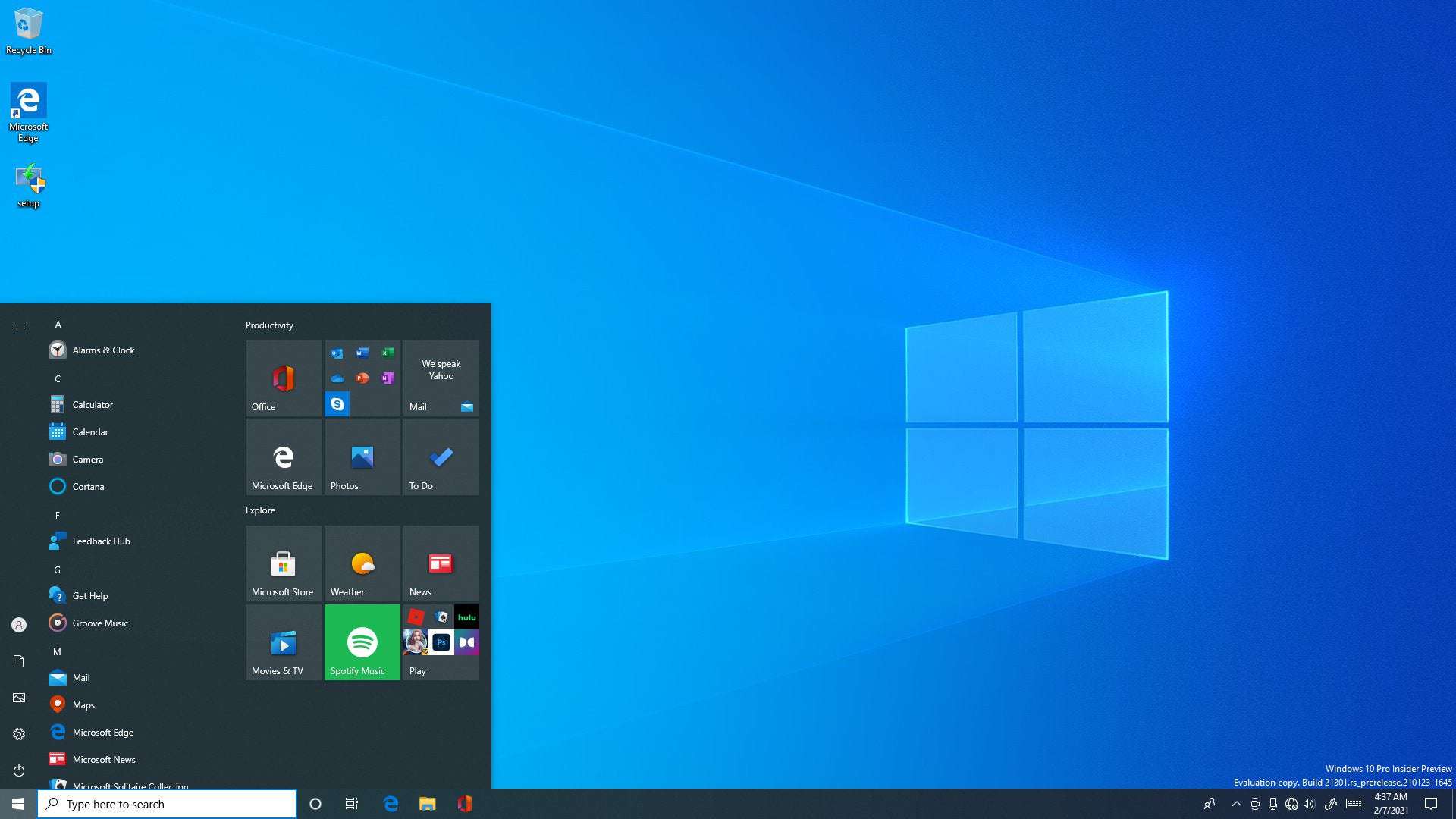
First, we begin with the latest and greatest, Fluent Design. Announced in 2017 and introduced with Windows 10 1803 update, Fluent Design is a major redesign of the Modern Design Language 2 (MDL2), aimed at bringing elements like Light, Depth, Motion, Material, and Scale. It also introduces the Reveal effects and the Acrylic translucent background.
As of now, most of the inbox (UWP) applications have been upgraded to take use of Fluent elements, as well as some of the more front-facing elements, like the Start Menu, Activity Center and the Login Screen.
Although Fluent Design was well appreciated, most of the enthusiasts considered this move too little, too late, as only a small subset of features have been enhanced with this new design style.
Just as we dig a bit deeper into the OS, we can see elements that haven’t been upgraded since Windows 8/8.1.
Some of these are glaring omissions, like the volume flyout, the USB flyout as well as some elements from the login screen.
Other Metro elements, although not as prominent, are the boot screen (which will soon be replaced with a newer one) and WinRE
Did you know: the first time the spinning dots were introduced was in Windows 8 build 7989.
Alright, let’s get down to the third layer: Windows 8 Win32 elements.
Just like Windows 10, Windows 8 was also plagued with inconsistency issues (for better or for worse). However, Windows 8 added meaningful enhancements to major user elements, like the Windows Explorer or Task Manager. Although they would receive some quality-of-life improvements in subsequent Windows 10 updates, changes would be minimal.
Also, an important change brought by Windows 8 was the redesign of the File Transfer dialogs.
Some of these changes started in Windows 7, which brings us to the fourth layer:
Windows 7 is without doubt one of the most beloved versions of Windows of all time, praised for its great enhancements over Windows Vista. It brought many new features that, although weren’t as significant as those that Vista introduces, made Windows 7 a very solid OS, and a true successor to Windows XP. However, one of the most infamous changes brought with Windows 7 is the Ribbon UI, which is a feature ported from Office 2007. Some of the apps that got updated with the new Ribbon UI are Paint and Wordpad.
Although at some point Microsoft decided to deprecate the classic Paint in favor of the new Paint 3D (introduced with Windows 10 Creators Update), after major backlash, they reversed their decision.
Other features that were updated in Windows 7 and remained the same ever since are: Windows Media Player 12, Remote Desktop Connection and some file dialogs.
Now, let’s go to the 5th layer of UI: Windows Vista.
Windows Vista was a monumental Windows release, one that brought much needed modernization to the platform. Almost all of the fundamentals of the OS have been in some way or another improved, from the bootloader to the driver model. However, as we all know by now, Windows Vista would come to be one of the worst Windows releases ever, plagued with issues from the beginning. One of the few features that were praised, though, was the UI. It redesigned some of the fundamentals that haven’t been updated since Windows 95. One of the main promotors of this change was the introduction of the so-called Aero Wizards, replaced the previous wizard standard, Wizard97.
Other features that were redesigned in Windows Vista and are basically the same in Windows 10: the Control Panel, the Search program, Windows Fax and Scan.
Speaking of Windows Vista: did you know that in certain special circumstances Windows 10 falls back to the Vista boot screen? It happens when your video card doesn’t support the video mode that the standard boot screen uses.
Now, we go back to the 6th layer: Windows XP
Believe it or not, there are not that many XP elements embedded into Windows 10. That’s probably because most of the fundamentals were updated already into Windows 2000. However, Windows 10 contains some file dialogs from XP, which are seen when one is installing a driver.
Windows 2000 was a big milestone for the NT lineup of operating systems from Microsoft. It also was the stepping stone that would signal the start the transition to a new, unified Windows vision. However, Windows 2000 was still a business-oriented OS, which means that it brought a lot of new features designed for experts.
One of the most significant addition is the Management Console (MMC), whose UI elements are basically the same ever since.
Another feature introduced by default in Windows 2000 is Windows Installer, which still has the same icon from when it was first introduced!
Another UI element that hasn’t changed (apart from branding, of course) is winver, whose design was introduced in Windows 2000 build 1946.
Credits to betawiki.org for the first image.
While Windows 2000 introduced lots of features aimed for power users, Windows 95 is probably the most significant Windows release to date. It introduced fundamental paradigms that still hold to this day. It introduced features like the Start Menu, context menus, the taskbar and recycle bin. While these features were of course updated over the course of many years, some remained almost exactly the same.
Now, onto the 8th layer: Windows 95/NT 4.0 elements.
An element that is basically a relic of the older computing habits, where one had to protect their precious CRT screen is the screensaver settings.
Another element that is strikingly similar is the Run box.
One more common UI element that passed the test of time is the folder properties screen.
And there are so many more UI elements that haven’t been touched since Windows 95. Is this a case of timeless design? I’ll let you judge for yourself.
Layer 9: Windows 3.1 and DOS… kind of.
Well, this is not really a “UI layer”, as I haven’t been able to find any interface elements predating Windows 95 (although I have a feeling that there certainly are). However, there is a peculiar file in Windows 10, called moricons.dll, which contains a lot of old icons from the DOS days. Take a look:
Well, that’s pretty much it. As you may know, Microsoft is planning on overhauling the UI of Windows with their “Sun Valley” update, which aims to unify the design of the OS. However, as we can see, Windows is one behemoth of an operating system. Will their efforts to finally make a cohesive user experience succeed? Only time will tell.
Blando-Cartesian on June 19th, 2021 at 11:43 UTC »
If you have drivers on a floppy disk and a floppy disk drive, you can install them just like in the 90’s. The dialog straight from Windows 95 is still there.
blackmist on June 19th, 2021 at 11:10 UTC »
I like the bit where you try to change where a program installs itself, and then Windows opens up this tiny dialog box that Noah might have used to decide where to build his ark.
flundstrom2 on June 19th, 2021 at 09:54 UTC »
I wish Microsoft would take a pause from adding new UI variant, and instead updating all programs already bundled with the OS. And by the way, unifying the settings. Theres at least three different locations where settings are to be found, depending on whether or not those specific settings had been "modernized to the new UI".
All in all, Windows is a mish-mash of incoherent programs.