The Pixel 3 has been one of the wildest product launches in recent memory. The leaks arrived early and continuously, starting with the screen protector leak all the way back in May. This not only gave us the basic outline of the phone, but it provided some extremely accurate renders, too, giving the Internet a look nearly five months before Google intended to ship. The initial response to the design was brutal, but it was too late—the Pixel 3 was already in the late stages of production. From there, leaks continued, and the launch lead-up felt like a slow-motion car crash. Dread it. Run from it. The Pixel 3 design arrives all the same.
It's now year three of Google's hardware initiative, and some product categories are clearly going better than others. The shining example of what Google Hardware should be is probably the Google Home brand. Google built a comprehensive lineup of unique, beautiful, well-performing hardware and paired it with industry-leading software, all at a range of prices that make the ecosystem easy to dive into.
I wish the smartphone section of Google Hardware was this good, but it just isn't yet. In smartphones Google still has an excellent (and often industry-leading!) software package, impressive performance and optimization, and an incredible camera, but it's paired with a hardware design that is firmly behind the rest of its 2018 competition. The lesser half of that equation does a disservice to the great work that goes into the rest of the phone.
So, this review is not of the Pixel that we would like to have, but the Pixel that we are stuck with: this is a thoroughly mixed bag of hardware and software at opposite ends of the quality spectrum. In 2018, how much can great software make up for a collection of not-great hardware decisions?
As usual, Google is launching two different phone sizes, the smaller Pixel 3 and the larger Pixel 3 XL. Besides the usual screen and battery size differences, the two devices differ in the top bezel design. The Pixel 3 XL has a notched design, while the Pixel 3 has a traditional straight bezel. Other than that, the two phones are identical, so while I only have a Pixel 3 XL in for review, everything save for the notch, screen size, and battery should be applicable to the Pixel 3, too.
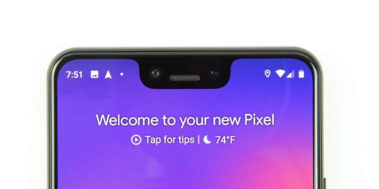
One of the biggest notches ever fitted to a smartphone
Now let's talk about that notch. Like every other non-Samsung phone released in 2018, the Pixel 3 XL screen goes all the way up into the top corner of the device, and then a big chunk is cut out of the top middle of the screen to fit various components. In addition to the notch, there's also a sizable bottom bezel featuring one of the two front stereo speakers.
SPECS AT A GLANCE Pixel 3 Pixel 3 XL SCREEN 2160×1080 5.5" (440 ppi) OLED, 18:9 aspect ratio 2960×1440 6.3" (523ppi) OLED, 18.5:9 aspect ratio OS Android 9.0 Pie CPU Eight-core Qualcomm Snapdragon 845 (Four 2.7GHz Kryo 385 Gold cores and four 1.8GHz Kryo 385 Silver cores) RAM 4GB GPU Adreno 630 STORAGE 64GB or 128GB NETWORKING 802.11b/g/n/ac, Bluetooth 5.0, GPS, NFC, eSIM Bands GSM: 850, 900, 1800, 1900
FDD-LTE: 1, 2, 3, 4, 5, 7, 8, 12, 13, 17, 18, 19, 20, 25, 26, 28, 29, 32, 66, 71
TD-LTE: 38, 39, 40, 41, 42, 46 PORTS USB 3.1 Type-C CAMERA 12MP rear camera, 8MP front camera SIZE 145.6×68.2×7.9mm (5.73×2.69×0.31 in) 158×76.7×7.9mm (6.22×3.02×0.31 in) WEIGHT 148g (5.22 oz) 184g (6.49 oz) BATTERY 2915mAh 3430mAh STARTING PRICE $799 $899 OTHER PERKS USB-PD quick charging, fingerprint sensor, IP68 dust and water resistance, Active Edge, Pixel Visual Core, Titan M security module
The Pixel 3 XL isn't just a notch design, it has one of the biggest notches ever fitted to a smartphone. Nearly every other smartphone manufacturer has kept its display cutout only as tall as a normal status bar, but Google's notch is twice as tall as normal, making the status bar twice as tall as normal. This means less usable space for apps and an awkward look to the whole top of the phone. Google's notch houses two front-facing cameras—one wide-angle, one normal—and an earpiece/speaker.
Google Pixel 3 and Pixel 3 XL Starts at: $799.99 and $929.99 at Verizon Buy
There isn't a huge range of variability in modern smartphone designs, but it's hard to not call the Pixel 3 XL one of the worst smartphone designs of the year. If we made the Design Power Rankings for notched smartphones, how many phones would you place below the Pixel 3 XL? I think every phone that fits the notch inside a standard-size status bar height is doing a better job than Google—that's every iPhone X variant, the OnePlus 6, LG V40, ZTE's Axon 9 Pro, and like a hundred phones from Xiaomi, Huawei, and Oppo. Some of these companies are on second-generation notch designs, producing really minimal notch designs like the Oppo R17 and OnePlus 6T. Even something like the Essential Phone—which has the same double-height status bar as the Pixel 3 XL—isn't nearly as wide as the 3 XL notch, so you can see a larger number of status icons.
I don't think there's a single flagship smartphone design from 2018 or 2017 that you can say Google has beaten with this release. In fact, you don't even need to stick to flagships to come up with something competitive to Google's design here. Is the $349 Nokia 7.1 design better than Google's $900 smartphone? They look nearly identical, but the Nokia 7.1 doesn't have a double-height status bar. The fact that we can even make this comparison is embarrassing for Google.
And thus far, Google doesn't seem to be bragging about the Pixel 3 and 3 XL design. While watching the Pixel 3 announcement it struck me as odd just how hard it was to catch a clear view of the bezels or notch. During the presentation, Google primarily showed the back of the phone, and whenever the phone flipped over, the camera zoomed in to the screen and cut off the bezels. If you did get an unobstructed look at the front, it had a dark image, which did a decent job of hiding the bezels and notch.
The notch design isn't just embarrassing, it actively hurts the phone's usability. The status bar might be twice as tall as normal, but horizontally, it doesn't have nearly enough room to work with. On the left side, you'll usually be able to see a whopping two or three notification icons. If you have exactly three icons, you can see three notification icons. But usually the third slot is taken up by the "more" icon, so you only actually see two icons.
On the right side, you see the battery icon, LTE and Wi-Fi connectivity, and then about three status icons for vibration/silence, alarm, do not disturb, hotspot, and Bluetooth. I like to have the battery percentage enabled on my phone, so I get to see the battery and connectivity information... but then I run out of space. On the Pixel 3 XL, I have to choose between seeing the battery percentage at a glance or knowing if the phone is on silent or has an alarm set. In other phone reviews, I've purposely tried to overload notched status bars to see how they work, but I don't have to try that with the Pixel 3 XL—it cannot handle my normal status bar loadout. To be fair, this is a problem on iPhone X-style iPhones, too. Both Google and Apple are supposedly designing their hardware and software together, but neither one really addressed the lack of status bar space with a notch design.
Google should have done something about the status bar icon limit. What good is owning the hardware and software if you don't make the two work well together? Smaller icons would have helped, or maybe Google could have come up with something that uses the extra vertical space on the status bar. Or, it could have designed the icons to be more compact and more respectful of horizontal space given that horizontal space is limited. In Android 9 Pie, Google did move the time over to the left side of the screen to try to balance the status bar on either side of the notch, but that's just not enough in practice.
As a user, you can try to mitigate the icon limitation somewhat by setting the display size to "small," which will make everything on the entire phone smaller, giving you an extra icon slot on either side of the notch. This is definitely not an elegant solution to this, though, and some people won't like the smaller text. In terms of aesthetics, many Android smartphones have an option to hide the notch by blacking out the notch area and only showing icons there. Google doesn't yet have a consumer-facing option to do this, but it has said it will add one. In the meantime, there is an app called "Nacho Notch" that can hide the notch on the Pixel 3. The only downside is that it needs to spawn a permanent notification to work.
Thanks to Android Pie, you can also jump into the developer options and change the display cutout emulation to "none." This will completely disable the notch area and give you a full, normal size status bar just below the notch. The result is basically zero year-over-year bezel improvement versus the Pixel 2 XL, but it's an option.
The justification for the huge notch on the Pixel 3 XL and the sizable top bezel on the Pixel 3 is the front-facing earpiece/speaker and the dual camera setup. We'll deal with the camera functionality in the camera section, but in terms of device design, Google seems to be behind the pack here. A lot of other OEMs are able to fit this functionality into a normal-height notch, and while this is pretty much the only device with two front cameras, a second camera should just take up more horizontal space, not more vertical space. Apple managed to pack the iPhone X notch with a ton of components for Face ID, and it still keeps everything inside a normal-height status bar.
Colossus1090 on October 15th, 2018 at 19:50 UTC »
This is what really irks me about the way stock handles gestures. There has got to be a better solution. Pixel 4 maybe?
iAWong02 on October 15th, 2018 at 17:58 UTC »
Just give me Samsung hardware with Google software. Boom. Instant perfect phone
GreenPylons on October 15th, 2018 at 16:51 UTC »
That part though where Ron shits on HTC for making subpar hardware and blaming them for the Pixel's hardware faults, links their HTC M9 and U11 reviews as examples of HTC's shitty hardware, and then conveniently skips over the time they called the HTC 10 the best flagship of 2016