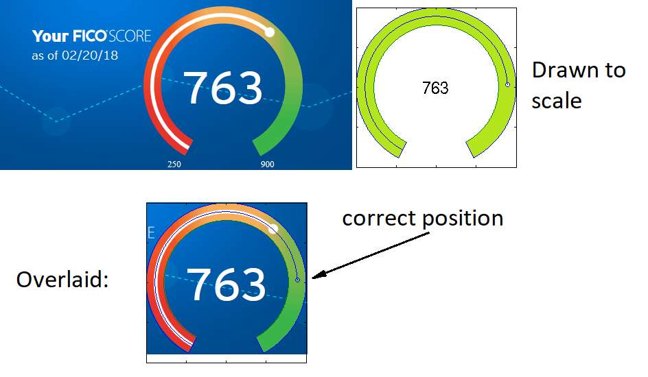
UPDATE 2: the scale in my corrected version does go from 250 to 900 as well.
UPDATE 1: if you want to play with the visualization, here is a Processing sketch. Hit "render sketch" and enjoy. The code is Java-like.
As soon as I saw it, I thought that it looks fake: you would expect that as the score ranges from 250 to 900, the wide dot would go linearly (in degrees) from start to end, but that is not the case.
So I produced some (sorry!) Matlab code to draw this diagram correctly:
s = 763; % actual score smin = 250.0; %min FICO smax = 900.0; %max FICO %aesthetic constants k = 0.78; k2 = (k+1.0)/2.0; theta0=28.0; %the big arc covers 360-2*theta0 degrees %the big arc theta = [theta0:0.1:360.0-theta0] - 90.0; x = cosd(theta); y = sind(theta); %arclength of the arc corresponding to score, in degrees arcl = (s - smin)/(smax - smin) * (360.0 - 2*theta0); %score arc th2 = -[0:0.1:arcl] - 90.0 - theta0; x2=k2*cosd(th2); y2=k2*sind(th2); %line ends drawing function cap = @(th, k) plot([cosd(th) cosd(th)*k], [sind(th), sind(th)*k]); %drawing clf axis([-1 1 -1 1]); axis equal; plot(x, y, k*x, k*y); hold on cap(-90.0-theta0, k); cap(-90.0+theta0, k); plot(x2, y2); plot(x2(end), y2(end), 'o'); text(0,0,sprintf('%d',s),'FontSize',20, 'HorizontalAlignment', 'center'); disp('Done.');
If people are interested, I can re-write it as a JS widget so you can plug in your score if you are a Citi user and want to see how badly they displayed your score.
It's not "lower", necessarily, but they're correctly constraining the range to reflect the non-linear nature of FICO scores. Although the formula may nominally extend as low as the 200s and as high as 900, the actual variation of scores is constrained to a smaller space (the population below 500 is extremely small, for example). This is the same reason all our thermometers don't range in linear space from absolute zero to the surface temperature of the sun.
The main problem here is that the "gas gauge" metaphor doesn't work for something that isn't really a quantity, but instead a weighted index with no conceptual "zero". For example, the difference between 700 and 800 isn't "fourteen percent more" (more what?) but is instead some percentile or standard deviation value of a benchmark or reference sample. In practice, someone with a score of 800 might be twice as responsible as a 600, or whatever, however you define that. It's a unitless thing with no guarantee of linearity. (The actual FICO formula is secret, and the population distribution is asymmetrical.)
(This is also a source of confusion with IQ scores, where the choice to center the distribution at 100 means literally nothing and there's no sense in which me being a 90 IQ person means I'm "10 percent dumber" than the average person, since zero doesn't actually exist in that unit system, and 95% of the population falls within a +/- 30 point range. If you drew an "IQ gauge" from 0 to 200 in linear scale it would convey no information and all the points of interest would be tightly clustered in a narrow band.)
This is a common problem and is why the "gauge" or "dial" interface element is the wrong one to use almost all of the time, unless you are trying to present the user with a linear value of a measure that frequently ranges between a conceptual 0 and 100 percent (i.e. a literal gas gauge).
alterom on March 23rd, 2018 at 06:20 UTC »
UPDATE 2: the scale in my corrected version does go from 250 to 900 as well.
UPDATE 1: if you want to play with the visualization, here is a Processing sketch. Hit "render sketch" and enjoy. The code is Java-like.
As soon as I saw it, I thought that it looks fake: you would expect that as the score ranges from 250 to 900, the wide dot would go linearly (in degrees) from start to end, but that is not the case.
So I produced some (sorry!) Matlab code to draw this diagram correctly:
s = 763; % actual score smin = 250.0; %min FICO smax = 900.0; %max FICO %aesthetic constants k = 0.78; k2 = (k+1.0)/2.0; theta0=28.0; %the big arc covers 360-2*theta0 degrees %the big arc theta = [theta0:0.1:360.0-theta0] - 90.0; x = cosd(theta); y = sind(theta); %arclength of the arc corresponding to score, in degrees arcl = (s - smin)/(smax - smin) * (360.0 - 2*theta0); %score arc th2 = -[0:0.1:arcl] - 90.0 - theta0; x2=k2*cosd(th2); y2=k2*sind(th2); %line ends drawing function cap = @(th, k) plot([cosd(th) cosd(th)*k], [sind(th), sind(th)*k]); %drawing clf axis([-1 1 -1 1]); axis equal; plot(x, y, k*x, k*y); hold on cap(-90.0-theta0, k); cap(-90.0+theta0, k); plot(x2, y2); plot(x2(end), y2(end), 'o'); text(0,0,sprintf('%d',s),'FontSize',20, 'HorizontalAlignment', 'center'); disp('Done.');If people are interested, I can re-write it as a JS widget so you can plug in your score if you are a Citi user and want to see how badly they displayed your score.
NecroHexr on March 23rd, 2018 at 08:06 UTC »
Uovote just because you put in more effort than 90% of the posts here
anechoicmedia on March 23rd, 2018 at 08:59 UTC »
It's not "lower", necessarily, but they're correctly constraining the range to reflect the non-linear nature of FICO scores. Although the formula may nominally extend as low as the 200s and as high as 900, the actual variation of scores is constrained to a smaller space (the population below 500 is extremely small, for example). This is the same reason all our thermometers don't range in linear space from absolute zero to the surface temperature of the sun.
The main problem here is that the "gas gauge" metaphor doesn't work for something that isn't really a quantity, but instead a weighted index with no conceptual "zero". For example, the difference between 700 and 800 isn't "fourteen percent more" (more what?) but is instead some percentile or standard deviation value of a benchmark or reference sample. In practice, someone with a score of 800 might be twice as responsible as a 600, or whatever, however you define that. It's a unitless thing with no guarantee of linearity. (The actual FICO formula is secret, and the population distribution is asymmetrical.)
(This is also a source of confusion with IQ scores, where the choice to center the distribution at 100 means literally nothing and there's no sense in which me being a 90 IQ person means I'm "10 percent dumber" than the average person, since zero doesn't actually exist in that unit system, and 95% of the population falls within a +/- 30 point range. If you drew an "IQ gauge" from 0 to 200 in linear scale it would convey no information and all the points of interest would be tightly clustered in a narrow band.)
This is a common problem and is why the "gauge" or "dial" interface element is the wrong one to use almost all of the time, unless you are trying to present the user with a linear value of a measure that frequently ranges between a conceptual 0 and 100 percent (i.e. a literal gas gauge).